scroll / drag


Work
A look at selected projects crafted with clients and collaborators.
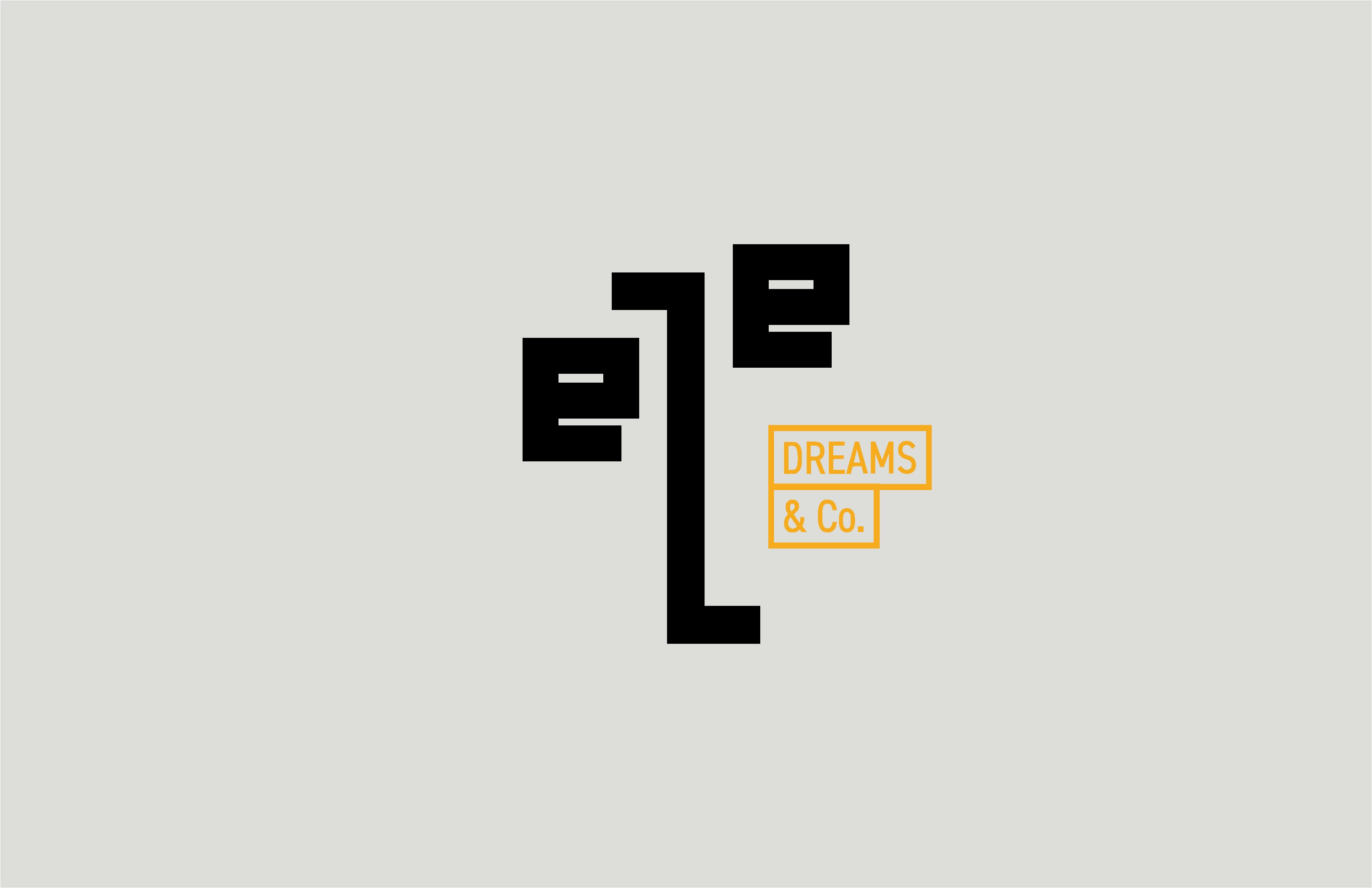
eZe Dreams & Co.
Eze Dreams & Co. is a creative venture built around turning ideas into reality. The brand needed to express that transition from imagination to construction. Something bold, clear, and unmistakable. A mark that could carry both precision and possibility.
Build-my-server
The ask: to redesign the brand identity for a custom server shop using a deliberately low-cost approach. The new brand needed to align with the store’s slogan “Nerds for life!” while conveying approachability, local connection, and intelligence.
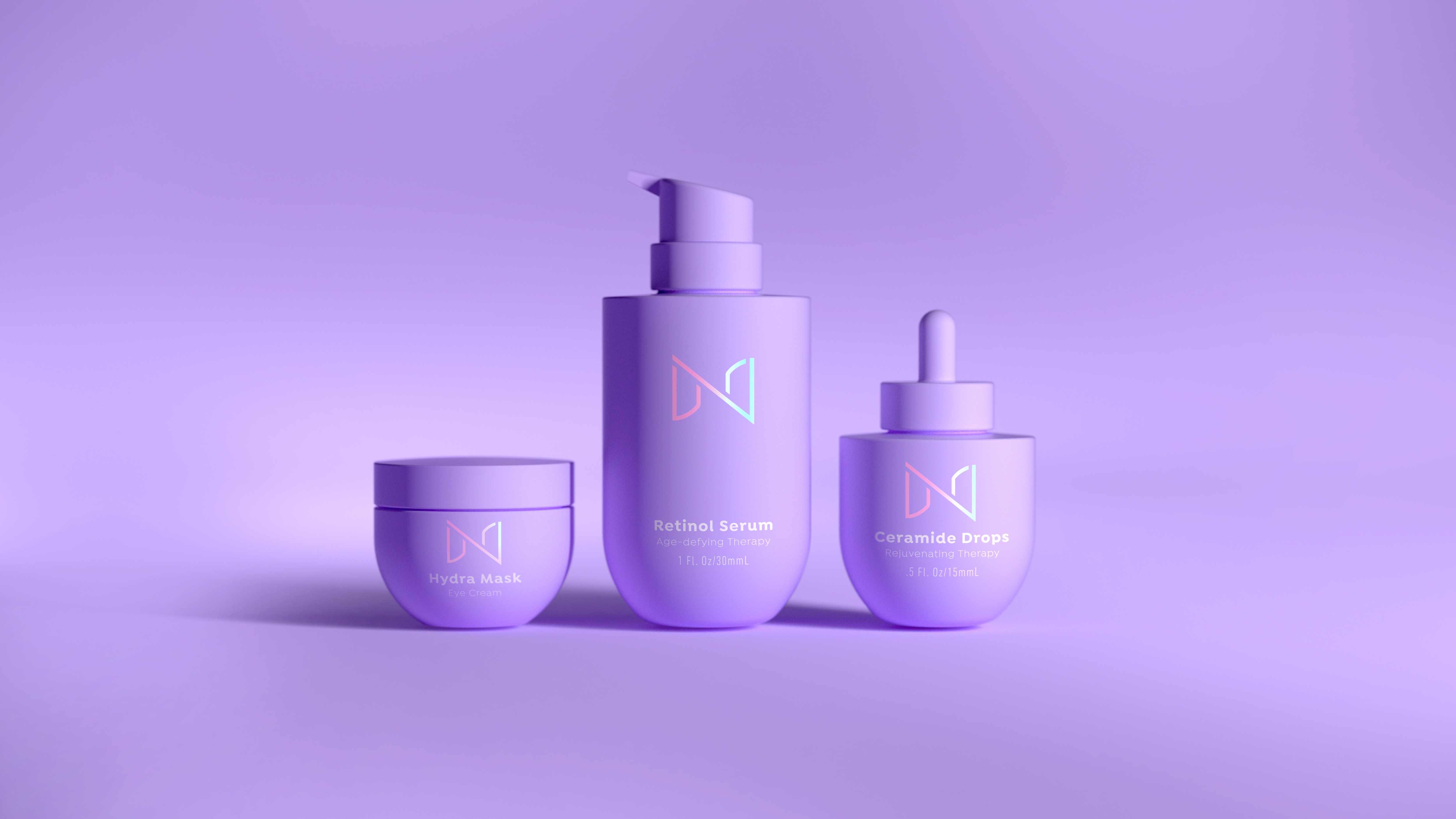
Dra. Nathalie RV
Dr. Nathalie Rodríguez Veras sought a visual identity that could express her philosophy of aesthetic medicine. One that balances scientific precision with a sense of care, beauty, and human connection. The brand needed to feel elegant and refined while remaining approachable. It had to reflect her commitment to holistic and integral medicine, where treatments are not only about appearance but about well-being.
A+B=3
Alta Señal
This project was to refresh the identity of Alta Señal, a technology and hardware retailer. The original brand had served the business for years but felt dated in a category that constantly evolves. The new identity needed to feel current and confident. A brand that could stand comfortably alongside the visual language of modern tech companies while remaining recognizable and memorable to its customers.
Jompéame
This exploration was developed as part of a Google UX certificate. I selected Jompéame to examine how its identity might more directly express what it stands for — urgency, empathy, and action.
Dr. MPS
We needed to create an brand identity for Dr. Marcos Pérez Santana, whose practice focuses on nutrition, internal medicine, and endocrinology. The brand needed to communicate medical expertise and professionalism while remaining warm and approachable. It had to reflect both the doctor’s scientific rigor and the human care that defines his relationship with patients.
x Nylaat
My collaboration with NYLAAT centers on translating the ideas behind each exhibition into a clear visual language. I enjoy studying the concept of every show, understanding its cultural context, and shaping a poster that communicates its purpose with immediacy and clarity. Each design becomes an interpretation of the exhibition itself. Through typography, color, and composition, the posters aim to reflect the themes explored by the artists while remaining accessible to the public.
The result is an evolving visual series where every exhibition introduces a new voice, while still belonging to the larger identity of the NYLAAT program.
NYLAAT
We were asked to create the identity for the New York Latin American Art Triennial (NYLAAT), an institution dedicated to presenting contemporary Latin American art within New York’s cultural landscape. The brand needed to reflect the vibrant authenticity of Latin American culture while maintaining the clarity and sophistication expected from major art institutions.
Luna Tours
The ask: create the identity for Luna Tours, a travel agency based in New York City dedicated to Caribbean destinations, with a special connection to the Dominican Republic. The brand needed to feel warm, inviting, and personal. A travel company built around tailored experiences, where every trip is designed to match the traveler.
Fórmula C.
We were tasked to create the identity for Formula Consulting, a consulting and advisory firm based in the Dominican Republic. The brand needed to reflect the company’s credo: creating solutions that simplify decision-making. It had to feel intelligent, sober, and clear. A system that communicates analytical thinking without feeling distant or overly technical.