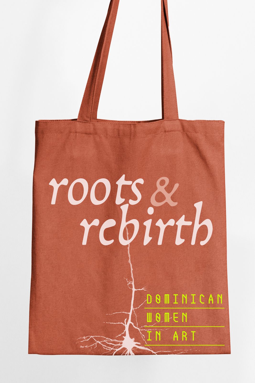
My collaboration with NYLAAT centers on translating the ideas behind each exhibition into a clear visual language. I enjoy studying the concept of every show, understanding its cultural context, and shaping a poster that communicates its purpose with immediacy and clarity. Each design becomes an interpretation of the exhibition itself. Through typography, color, and composition, the posters aim to reflect the themes explored by the artists while remaining accessible to the public.
The result is an evolving visual series where every exhibition introduces a new voice, while still belonging to the larger identity of the NYLAAT program.
Creative Direction/Design
Each exhibition for NYLAAT becomes an opportunity to explore typography, rhythm, and cultural expression.The posters are not treated as static announcements but as visual interpretations of the exhibition itself. Typography becomes the main material. Letters expand, fragment, and reorganize to create compositions that echo the energy of the artists and themes being presented. Color, form, and typographic experimentation allow each poster to develop its own voice while remaining part of the NYLAAT visual language. The result is a growing series where every exhibition adds a new variation to the system.