We were tasked to create the identity for Formula Consulting, a consulting and advisory firm based in the Dominican Republic. The brand needed to reflect the company’s credo: creating solutions that simplify decision-making. It had to feel intelligent, sober, and clear. A system that communicates analytical thinking without feeling distant or overly technical.
Naming | Brand Strategy | Identity Design | Creative Direction
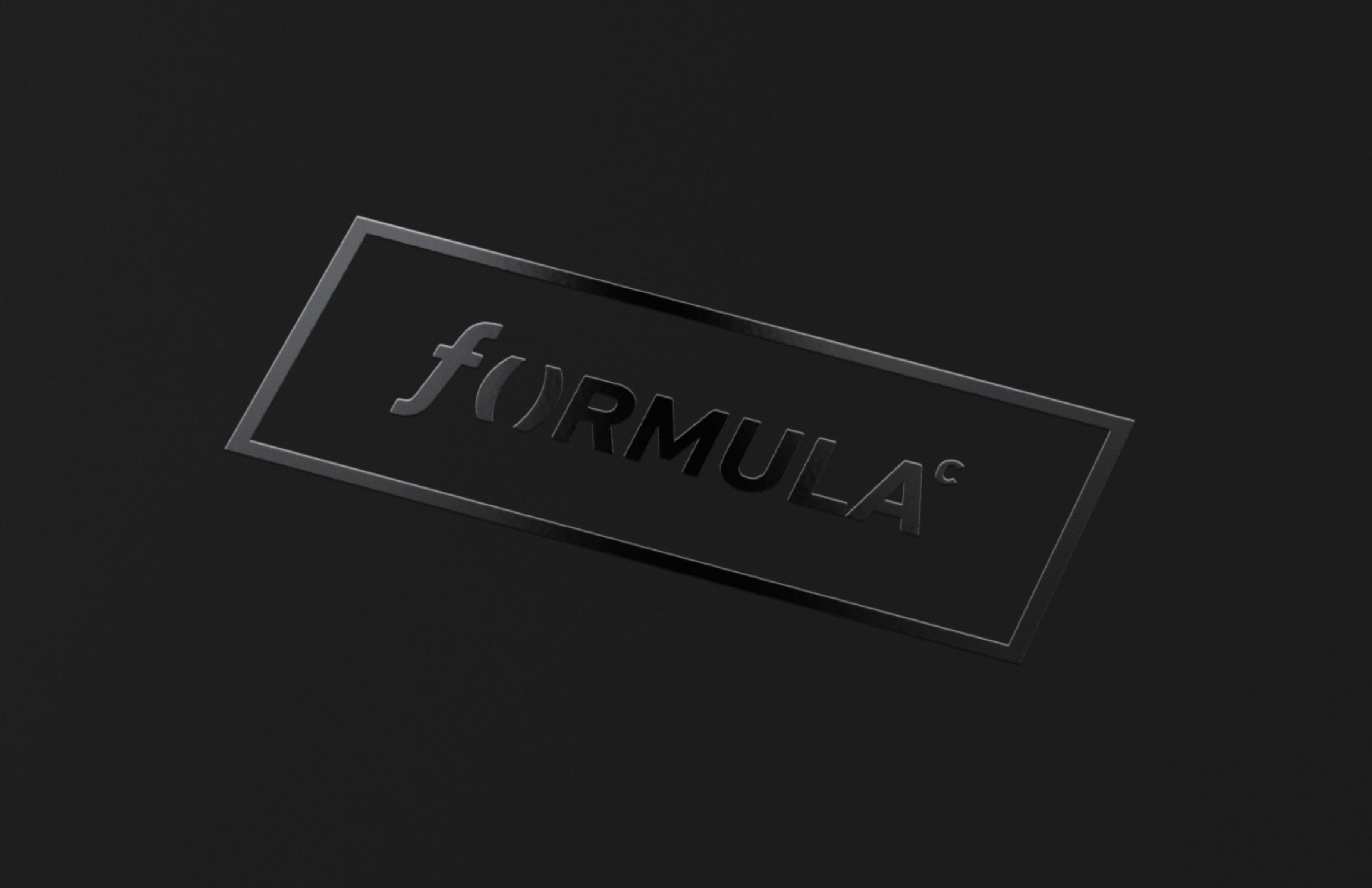
The identity draws from the language of mathematics. The symbol is inspired by the notation of a function, where an input leads to a result. A simple idea that mirrors the work of the consultancy: analyzing complexity and turning it into clear outcomes. The visual language stays restrained and precise. Black and white reinforce clarity and authority, while the typographic structure keeps the system grounded and direct. The result is a mark that feels analytical yet accessible. A symbol that quietly suggests logic, structure, and the confidence of a well-built formula.


The identity presents Formula Consulting as thoughtful and composed. The visual system is minimal yet distinctive, allowing the brand to feel intelligent without appearing rigid. By borrowing from the language of mathematics, the mark communicates exactly what the firm stands for: clear thinking, structured solutions, and decisions built on logic.