This project was to refresh the identity of Alta Señal, a technology and hardware retailer. The original brand had served the business for years but felt dated in a category that constantly evolves. The new identity needed to feel current and confident. A brand that could stand comfortably alongside the visual language of modern tech companies while remaining recognizable and memorable to its customers.
Brand Identity Design | Creative Direction
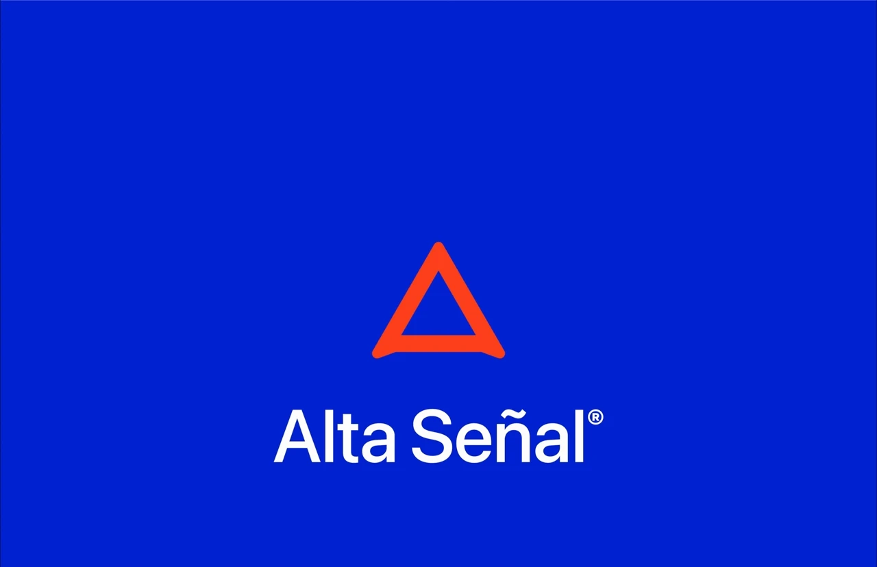
The concept centers on the idea of signal. In technology, signal represents connection, transmission, and clarity. The icon transforms the letter A into a transmission tower broadcasting a signal, connecting Alta Señal with one of the most universally recognized symbols of connectivity. This simple gesture ties the name of the brand directly to the idea of communication and reach.
The visual language follows the principles of contemporary technology brands: precise geometry, balanced proportions, and bold color that communicates clearly across digital and physical environments. The result is a mark that feels familiar to the language of modern devices while remaining distinctive and memorable.


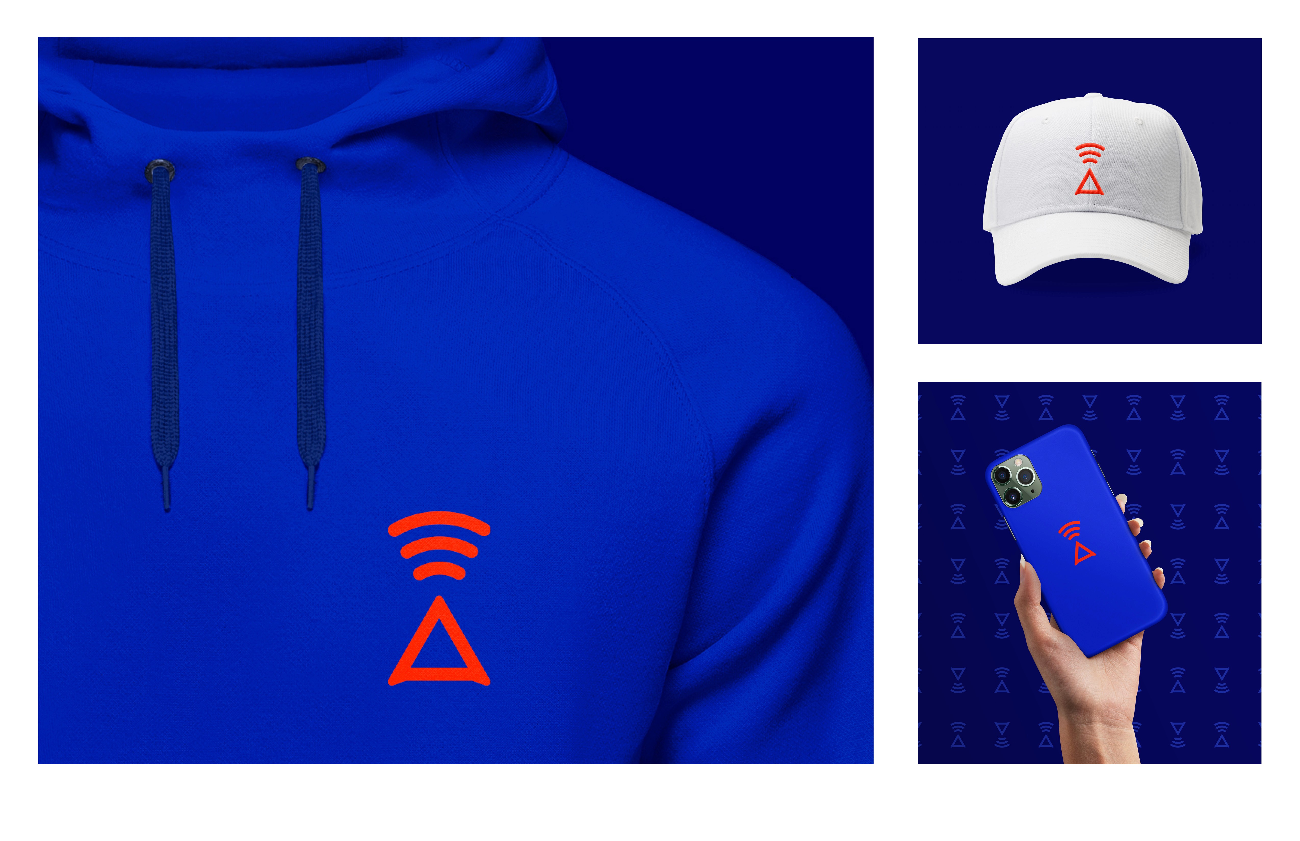

The redesign transforms Alta Señal into a brand that feels modern, confident, and unmistakably technological. By reducing the idea of signal into a simple graphic gesture, the identity becomes easy to recognize and flexible across storefronts, packaging, digital interfaces, and merchandise. The result is a brand that feels connected to the language of technology while staying approachable and memorable.